This September, Joe Gebbia, Airbnb cofounder and alum of my alma mater, Rhode Island School of Design, was named Chief Design Officer of the new National Design Studio (NDS) as part of President Trump’s recent “America by Design” initiative. The initiative’s purported goal is to help everyday Americans accomplish basic government tasks more easily: paying student loans, renewing passports, and even filing taxes.
In an interview, Gebbia described the move as overdue, casting it as proof of a new commitment to “beautifully designed” government services. The America By Design website makes the same point, albeit more profanely, suggesting that public infrastructure ought to welcome citizens “the same way a hotelier anticipates the needs of their guests.” How Trumpian. But Gebbia’s own shorthand for this new U.S. design philosophy was clearest of all in describing what Make-America-Designed-Again entails: government, he argued, should “feel more like an Apple Store.”
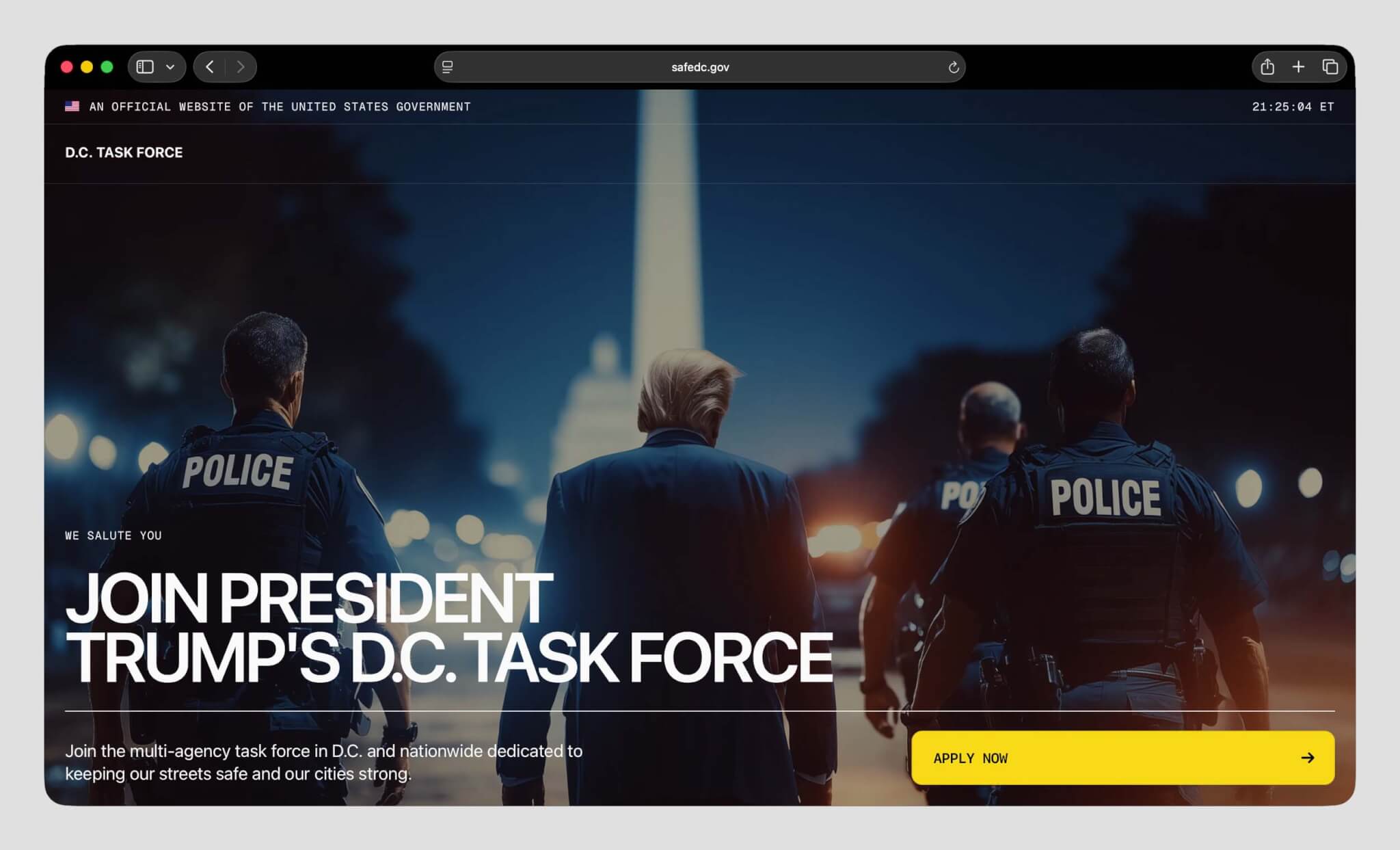
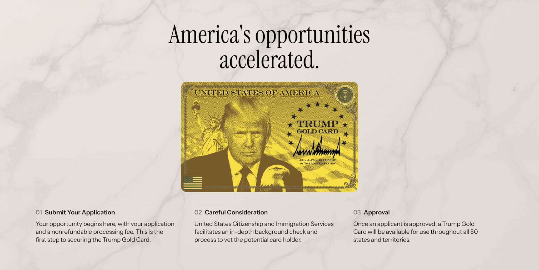
If you land on the homepages for some of NDS’s first forays—the NDS site itself, the Trump Gold Card site, or the Safe DC initiative—the Apple Store isn’t exactly what comes to mind first. The Safe DC site begins with an AI-generated image of Trump flanked by armed police, and ends with the words Task Force stomped on by a muddy boot print (in other words: tread on me, daddy). It’s more “true crime drama” than “consumer tech minimalism.” The Trump Card website is similarly perplexing, sort of like if someone tried to redesign a credit card with the visual language of a protein bar. It uses Instrument Serif, an open-source revival of the condensed serif style Apple favored in the 1980s, now repopularized and in use by everyone from Vacation Sunscreen and Graza Olive Oil to tech darling Perplexity. Beyond the obvious Steve Jobs fan service, Trump has a documented preoccupation with serifs; he recently ordered all government documents reverted to Times New Roman (a state department cable described the move to the prior typeface, the sans serif Calibri, as “yet another wasteful DEI program”). If Times New Roman calls to mind ’90s Microsoft Word and early 2000s CIA Interrogation Reports, Instrument Serif points a bit more backwards—toward Trump’s own 1980s aesthetic of luxury and excess, and a broader conservative nostalgia for that era’s corporate gloss.
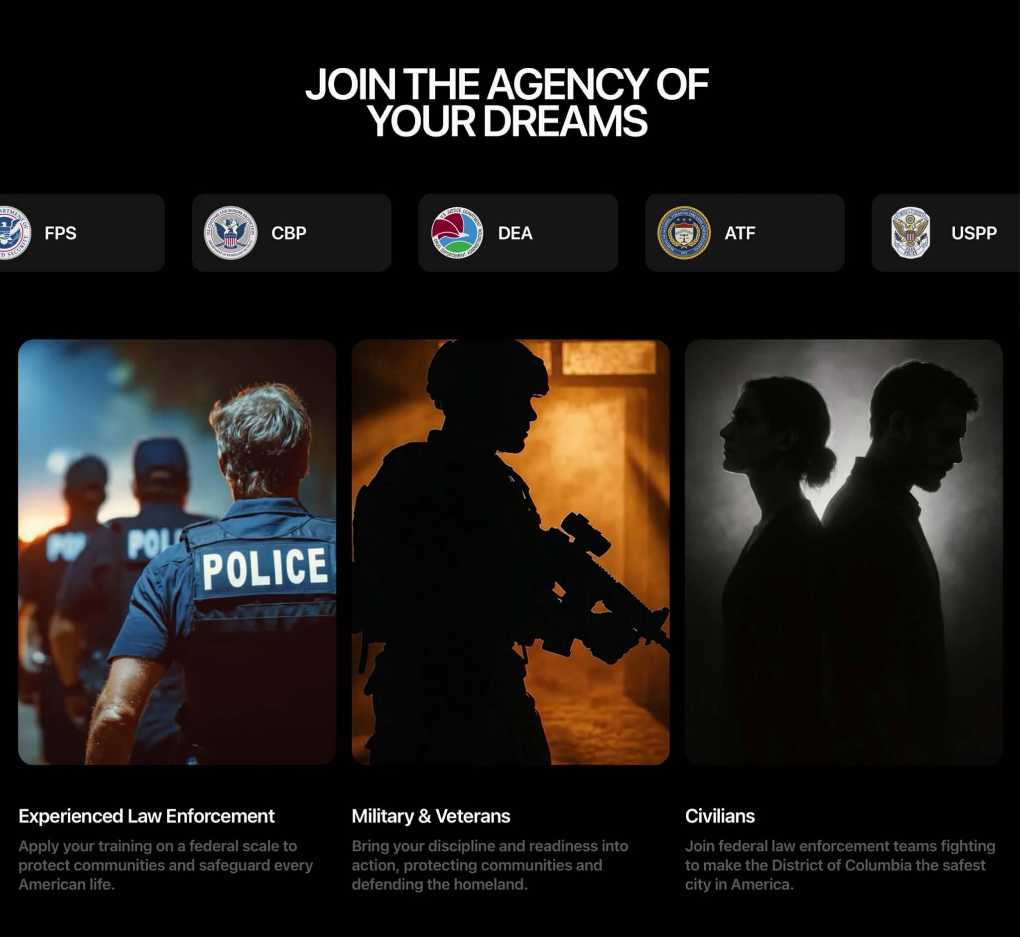
For a division that promised better services, the National Design Studio’s first releases are remarkably devoid of services altogether. Of the four (soon to be five) public-facing projects associated with NDS, none meaningfully connect users to a government system where any real task can be completed. The Trump Card and NDS site have embedded application forms that are sent to an unlisted inbox, and despite all its visual theatrics, the Safe DC site offers exactly one clickable element: a button at the bottom of the page—with sound effects!—that redirects to USAJobs.gov, a site launched in 1996 that appears to have kept its homepage nearly the same for a decade. The National Design Studio seems to suggest that this simplicity is a product of their interest in keeping government websites “beautiful” and “clear,” but systems can only be beautiful and clear if they work. Defining success by a metric of beauty offers a useful kind of vagueness, one that NDS seems to hide behind despite the slow loading times or unnavigability that seem to define their output; you can argue with slow loading times or difficulty finding a form, but you cannot meaningfully argue with “beautiful.”
On a technical level, the NDS sites leave much to be desired. Former federal designer Ethan Marcotte writes that the America by Design website not only fails basic ADA web compliance, but ships close to three megabytes of code to boot. For those unfamiliar with web design, this technical cost is comically outsized. Three MB is the kind of payload you’d expect from an image-heavy editorial feature or an interactive map, not from a single page featuring a single style of text. Looking at the code explains the bloat: tech-savvy sleuths determined that the animated eagle at the bottom of the page loads as dozens of image files instead of a lightweight animation. As the parody site America by Design Fail put it, “Why does this look like someone’s first coding project?”
It goes without saying that accessibility and inclusion do not rank highly for this administration, but the practical consequences of decisions like payload size have huge impacts on disadvantaged groups regardless. Websites with heavy data requirements punish people who have older hardware, limited data plans, or slow internet connections—the very people government services usually aim to consider most. The simplicity of the site means it may be plainer and easier to navigate than other government websites, but the lack of any serious investment in low-data access, translation, and multilingual support makes it clear who it’s designed to be easy for.
While advertising and branding exist to shape how something feels, the goal of civic design is usually to shape how something works, and how to make institutions comprehensible to the people who are governed by them. From what is visible so far, the National Design Studio isn’t functioning as a civic design program so much as an advertising agency for the administration and its policy goals. If one was feeling less charitable, they might simply call it a digital propaganda department. When the government adopts branding as its dominant design mode, citizens stop being users and start becoming followers, or better yet, consumers (see also: Trump’s fixation on the postal service turning a profit). The existing NDS sites therefore behave more like billboards than public infrastructure. They frame the state as something to be encountered emotionally rather than used practically; a beautiful picture behind glass instead of a worksheet to be filled out.
What makes this shift hardest to justify is that the federal government already had a design and technology office whose job was to actually make government UX work better. From 2014 to 2025, that work lived inside 18F, a digital-services initiative that completed more than 455 projects across 34 agencies and all three branches of the federal government. Its work focused on the unglamorous parts of government infrastructure: building and maintaining systems like Login.gov and the U.S. Web Design System, modernizing permitting systems, and supporting public-facing services from weather.gov to civil-rights reporting databases.
One of its most consequential projects was the now defunct IRS Direct File—a free, government-run platform that allowed eligible taxpayers to file returns without relying on costly for-profit services like TurboTax or H&R Block. People loved it. During its pilot, Direct File earned a Net Promoter Score in the +70s (the average score is +32), and users described it as simple and trustworthy. This is the context in which the National Design Studio was launched. A studio promising to make government “feel like an Apple Store” arrived at the same moment one of the only programs that reduced friction was being dismantled. The explanation from the current administration was blunt: “We think the private sector can do a better job.”

Gebbia was right to cite the Apple Store as a model—just not in the way he probably meant. The Apple Store is not a metaphor for usability, or even for beauty; it is a model of emotional control. It is engineered to feel clear and welcoming while revealing almost nothing about itself. You’re told many things about products—camera improvements, new chips, why your existing chargers are suddenly obsolete—but always inside a managed narrative, never in a way that gives you real insight into how anything works. When you hand over a broken MacBook, it disappears into a back room or an off-site facility and returns when and how it returns. You’re taught what the device is for, but not how it functions or fails. In fact, you’re encouraged to feel safer not knowing. That posture works for retail because inconvenience is the worst-case scenario. But applied to government, it governs your relationship to power itself. Instead of learning how a process works, you’re trained to submit to it.
Ultimately, the National Design Studio solves a problem no one actually has. There is no unmet demand for better vibes from the federal government. There is simply a demand for systems that work and processes that make sense. While we wait for that, the NDS is busy trying to make government appear simpler at exactly the moment it is becoming more difficult to understand, harder to challenge, and much easier to weaponize.
Elizabeth Goodspeed is a graphic designer and writer who’s interested in visual culture, design history, and aesthetic trends.
→ Continue reading at The Architect's Newspaper
