British graphic designer John Morgan died on September 2. He was 52. According to a statement shared on Instagram, Morgan died “in his library, surrounded by his family and his books.” He is survived by his wife, Claire, and three children, Rudy, Francis, and Iris.
Morgan was born in Lancashire and attended the University of Reading where he studied typography and graphic communication. He worked in the office of British graphic designer Derek Birdsall before founding his own London-based practice, John Morgan studio, in 2000.
An important early project for Morgan was also his transition into independent practice: After Birdsall redesigned the Church of England’s book of prayer in 2000, Morgan worked on a new version of its Common Worship volume. Morgan’s talent was evident from the start, where he combined a detailed eye for type with an overall sense of atmosphere.
Beyond designing books, magazines, and signage, often for art-world clients, Morgan took on numerous architecture-related commissions. When Caruso St John needed a signage consultant for its master planning of Tate Britain or was looking for someone to design the chancel cross for its renovation of St. Gallen Cathedral, the office called Morgan.
Beginning in 2008, Morgan redesigned the architecture journal AA Files, published by the Architectural Association, with a sense of graphic stricture that was lightened with illustrated capital letters and creative layouts. Thomas Weaver, when starting as the editor of the publication, immediately redesigned the publication with a “fantastic graphic designer called John Morgan,” as he told an audience at Columbia GSAPP in 2014. The duo removed any cover imagery and instead set the title and issue number on a background color, established an “elegant but explicitly English template,” and proceeded to “monkey” around, using tricks like scratch-and-sniff text, stencil templates, and fold-out posters.
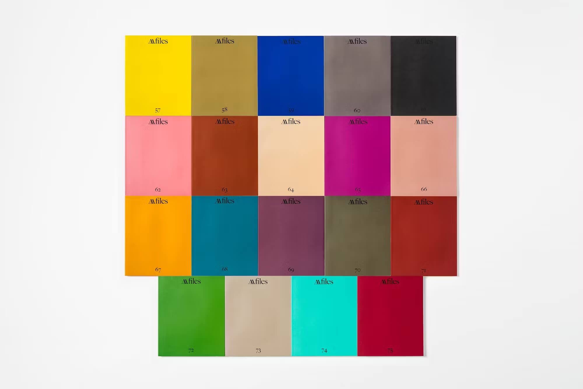
Morgan’s selections had stylistic effects across the architecture world. When The Architect’s Newspaper was redesigned in 2018 to celebrate 15 years of publishing, its art director introduced Arnhem as our “workhorse typeface,” which Morgan used in his reworking of AA Files. The words you are reading now are set in Arnhem Blond.
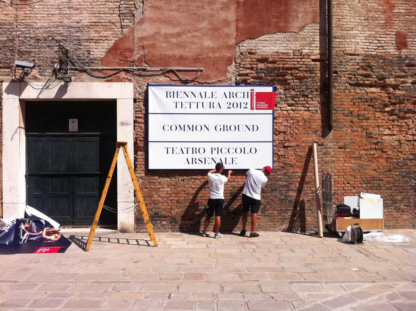
David Chipperfield worked closely with Morgan on a range of projects, beginning with a new graphic identity for the studio in 2008, and eventually going on to design the custom typeface, signage, and books for Common Ground, Chipperfield’s edition of the Venice Biennale in 2012, as well as for the firm’s website, and multiple books and exhibitions. The signage at Museo Jumex and the wayfinding at the Turner Contemporary? The “turret clock” blade sign at the (now-closed) Valentino flagship on Fifth Avenue? The signage of Chipperfield’s Bar do Porto Corrubedo? All are the work of Morgan for Chipperfield.
Morgan was also an educator. He lectured at Central Saint Martins and his alma mater, the University of Reading, where he led the MA Book Design course from 2007 until 2016. In that year, he became a professor at the Kunstakademie Düsseldorf where he led his own program, Klasse John Morgan, in design, typography, and book art. Morgan was a responsive instructor: At one point, he found his pupils at Central Saint Martins lacking in detail-focused assignments, so he tasked them with the layout of a phone book.
In 2017, Morgan cofounded the digital type foundry and independent publisher of artist’s editions and multiples ABYME with designer Adrien Vasquez. Drawing its name from the terminology “mise en abyme,” the publisher was a platform that found new lives for typefaces originating in John Morgan studio’s work.
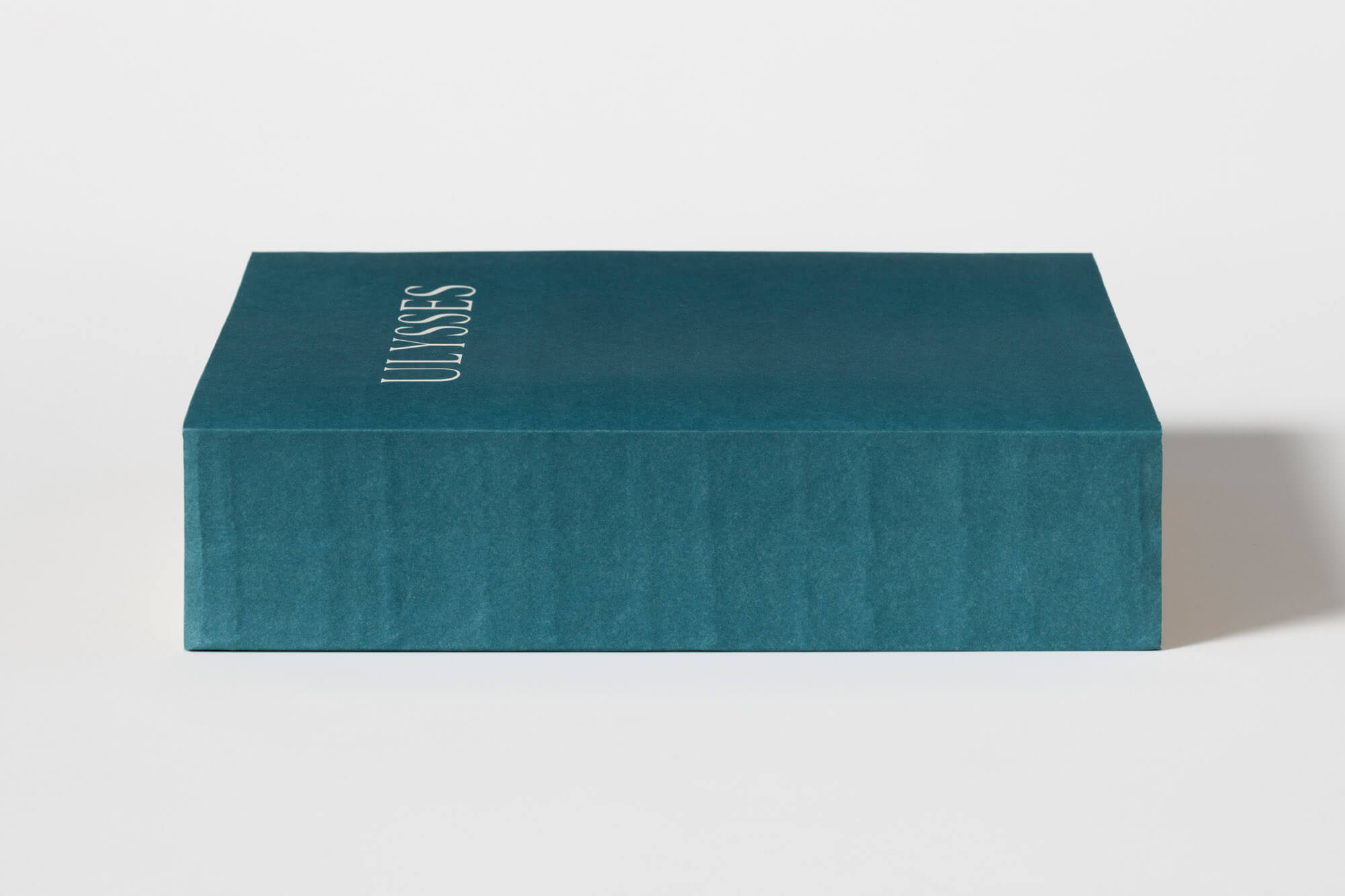
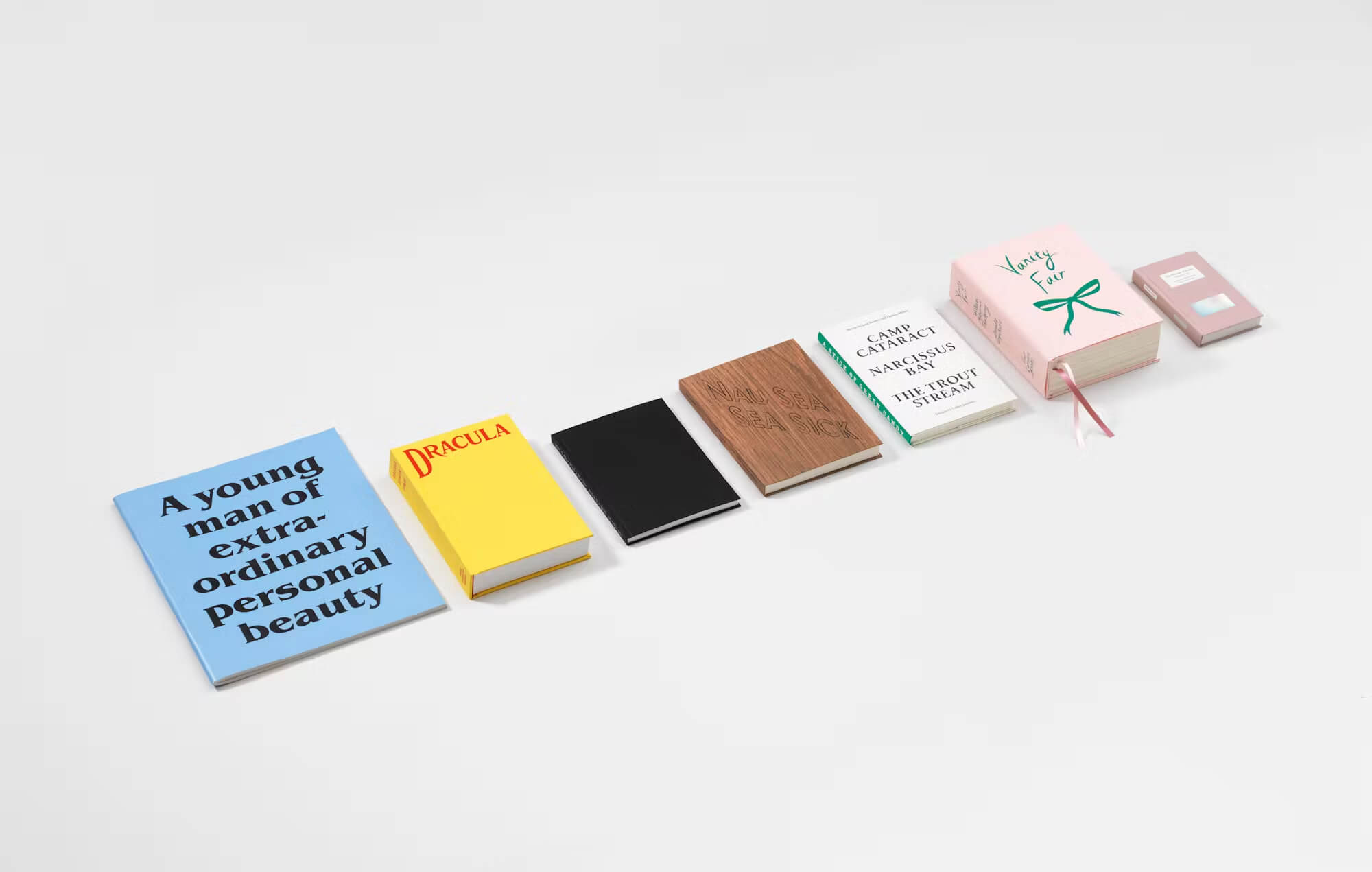
Morgan’s fascination and experimentation with the format of the book continued with his publication of Usylessly in 2021, which was “the result of a close observation of the blue cover and form of the first edition of James Joyce’s Ulysses.” The book reproduces the volume of the original 1922 edition but is largely blank inside except for two essays: one on the book’s appearance as a physical object, and the other about the search for the right blue for the original cover.
A second edition of Usylessly will be published in 2025, as will Morgan’s Baskerville’s Teardrop Explodes: A Selection of Books as Muses. Both titles will appear via Ten Thousand Angels Press, an imprint Morgan established this year.
Morgan helped to usher in a post-2008 era of artful austerity in book design. Perhaps there would be no Fitzcarraldo Editions without Morgan’s influence on early 20th–century graphic design. The maximalism of the 1990s and early 2000s, as evidenced in the doorstop-worthy, book-as-research projects, evaporated, replaced by a slim-fit sensibility that prioritized meaning, considered typography, rigorous (and artful) image selection, and a keen attention to historic precedent. Creating objects of extraordinary personal beauty was Morgan’s goal. The opening of his brand book for David Chipperfield Architects began: “The first guideline is to work with a good designer.”
Heartfelt Remembrances
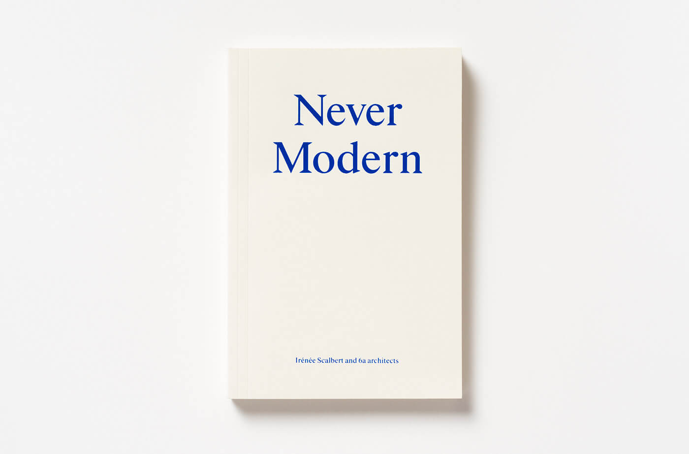
Tom Emerson of 6a architects worked for years with Morgan, who designed the websites for 6a architects and Emerson’s studio at ETH Zürich. Morgan also designed 6a architects’s 2013 book Never Modern and Dirty Old River, Emerson’s latest book of essays, published earlier this year.
Emerson told AN via email: “John was a true friend made over nearly two decades of collaboration starting with Raven Row then into our own books and projects. He was a great designer and wonderful generous, funny person. He worked with so many amazing artists, writers, and architects on everything from digital, signage, and posters, but he loved type and books the most. I believe he designed over 200 books. He could transfer the nuances of prose onto the space of page and into your fingertips holding the book. Subtle and playful in equal measure, every book was a thing of beauty.”
Julie Cirelli, director of Park Books, shared: “I was exceptionally fortunate that, when I began as director at Park Books, one of the first figures I was able to collaborate with was John Morgan, whose work I had long admired for the care he brought to collaboration and to the making of books. His designs for Tom Emerson’s titles at Park Books were nothing short of brilliant, and Dirty Old River was the last book he designed. With his passing, we lose a singular voice in book design, a rare talent, and a genuinely kind and brilliant person.”
A spokesperson for the Architectural Association commented: “We are very sad to hear of the passing of John Morgan, and our thoughts are with his family during this tragic time. John was an influential visual force in making AA Files a permanent fixture on bookshelves around the world, one color cover at time, and we will always be grateful for his graphic vision.”
Online Tributes
Four Corners Books, which collaborated with Morgan for nearly 20 years, shared a statement of remembrance for its “hugely talented” friend on its website, which was also designed by Morgan. The U.K.-based press, had embarked on a series of Morgan-designed reissued novels—Dracula, Heart of Darkness, The Picture of Dorian Gray, and more—in which contemporary artists make images to accompany the text. “One of the strengths of the series came from John’s ability to work in different ways with each artist, and his flexible approach to collaboration was key to the books’ success,” wrote Four Corners founders Richard Embray and Elinor Jansz. They continued, “Over the years, our work with John grew into friendship, and we will miss him enormously: he was a brilliant designer, and a wonderful person.”
Others took to social media to share tributes.
In an Instagram post, longtime collaborator David Chipperfield Studio mourned Morgan’s death, writing that Morgan “displayed a deep kindness, curiosity and integrity and will be greatly missed by all at David Chipperfield Architects.”
In an Instagram story, British design critic Alice Rawsthorn wrote that Morgan was “a wonderful book designer who work from witty Usylessly to his delightful edition of Vanity Fair, and so much more has given me great pleasure.”
Graphic designer James Goggin, a friend and sometimes collaborator and competitor, shared a heartfelt remembrance online that praised Morgan’s “remarkable work and spirit.”
Matthew Blunderfield, host of the architecture podcast Scaffold, invited listeners to share memories of Morgan for an upcoming special episode. He wrote, “If you’ve ever worked with or learned from John and would like to contribute, please contact us.”
Concentrating on Beauty
Unfazed by trend, Morgan set his eyes on things that endure. His books, once memorably photographed with his kids, slip the bonds of timeliness. They could have been designed yesterday, today, or tomorrow; during the last century, or in the next one.
“Unlike many people, I find art and design quite a blunt instrument to deal with political and social issues,” Morgan said during an online lecture introduction in 2021 titled “Kind of Blue – The making of James Joyce’s Ulysses.” He continued: “I’m interested in the bigger ideas about human culture and the longer-term view of things. I’m interested in very unfashionable things, like beauty and how that might help us live in the world too. Design can help, but I’m also interested in very useless things and how the useless things can help us. […] I think we need culture, and I think we need beauty. I’m going to be concentrating on that.”
→ Continue reading at The Architect's Newspaper
